Arturo is a graphic designer from Serra Negra, São Paulo, Brazil. Graduated with a BA in Visual Arts from PUC University and currently completing an MA in Design for Publishing at ISIA Urbino, Italy. Since 2017, active in the graphic design industry across multiple sectors, including branding, visual identities, editorials and publishing, as well as exhibition projects, with experience collaborating with a variety of clients, agencies, and studios. Previously at Ouieieee, now at Studio Mut.


All rights reserved.
©2026 Arturo Anghinoni Campedelli
The entire website was designed and developed by Arturo Anghinoni Campedelli in collaboration with Roberta Antinolfi. All content, designs, images, and visual materials presented on this website are protected under copyright law and remain the intellectual property of their respective creators. This includes original works, collaborative projects, and contributions from other studios or professionals. All rights, including reproduction, distribution, adaptation, or public display, are fully reserved. Any use of these materials outside of personal reference or private viewing is strictly prohibited without prior written permission from the copyright holders. This applies to digital, print, editorial, and commercial uses alike. For licensing inquiries, requests for reproduction, or other permissions, please contact arturoanghinonicampedelli@gmail.com. All requests will be considered on a case-by-case basis to ensure proper credit and legal compliance.
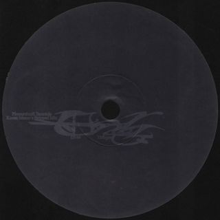
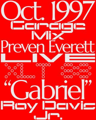
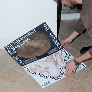
A selection of works developed in a more independent manner, including both self-initiated and freelance projects, comprising a body of graphic production that includes posters and communication systems for events, album and EP covers, as well as other graphic materials produced across different contexts, formats, and scales. This section brings together projects produced on a non-continuous basis and presented without thematic or chronological hierarchy, with the purpose of documenting a graphic practice carried out outside institutional commissions or fixed structures. The works respond to specific demands and operating conditions, reflecting formal, technical, and language decisions applied according to their intended use, modes of circulation, production constraints, and distribution contexts. Together, these materials provide an objective overview of a graphic production developed autonomously over time, emphasizing applicability and consistency across varied assignments.
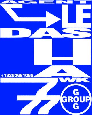
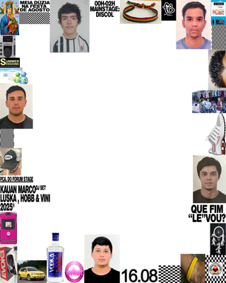
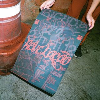
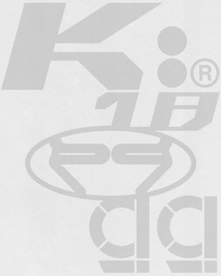
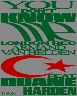
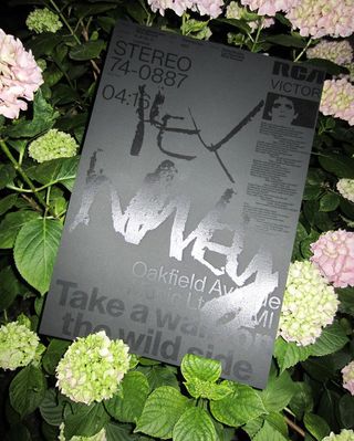
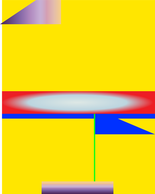
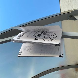
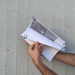
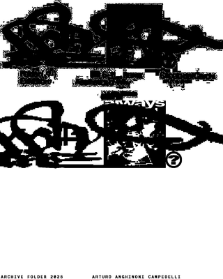
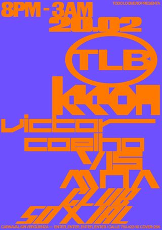
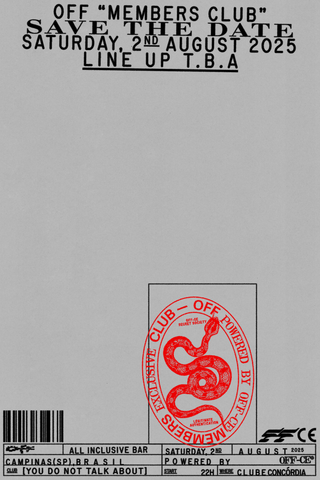
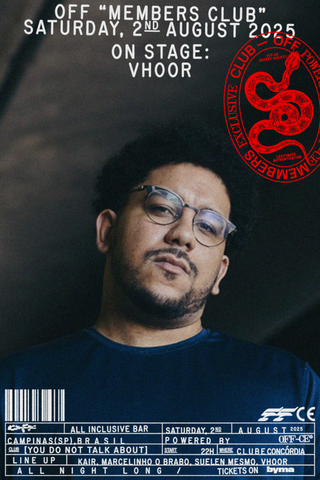
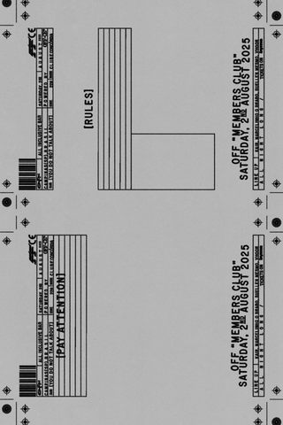
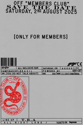
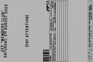
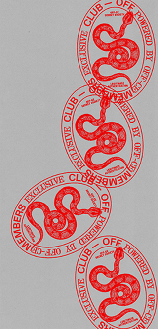
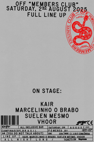
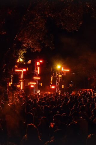
I was invited by Off-ce to develop the visual identity for a members club linked to the “Off” event. As it was a smaller, more curated gathering, we decided to ground the communication in the aesthetics of postcards and vintage club membership cards — objects often left forgotten in old drawers, yet once loaded with meaning, serving as tangible symbols of access, certification, and legitimacy. Although largely replaced today by digital systems, these artifacts carry a sense of permanence and intimacy that felt aligned with the spirit of the event. The gathering took place on August 2nd and featured DJ sets by Suelen Mesmo, Kair, and Vhoor, reinforcing the project’s focus on a selective, community-driven experience.

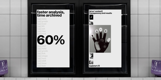
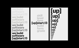
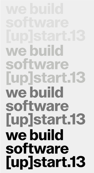
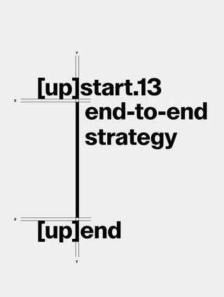
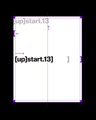
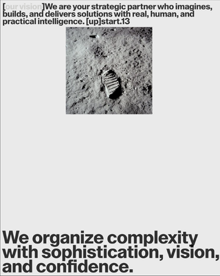
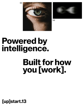
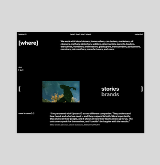
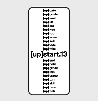
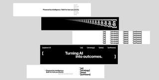
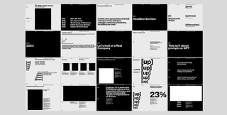
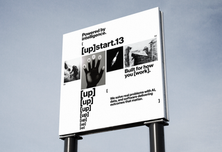
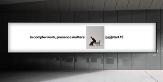
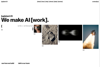
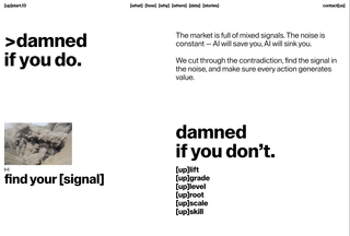
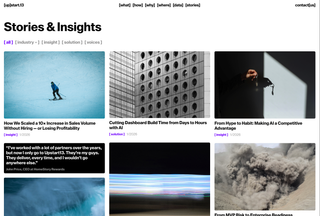
In this rebranding project, the client, [up]start.13, required a visual identity that could more directly relate to the product they offer, which is primarily the development of software and technological solutions for large companies. Based on this premise, the objective was to construct a system that was simple yet strong, and above all, highly reproducible. Reproducibility was understood at a level where the brand could be written, typed, and easily applied across different contexts. From this perspective, we identified the consistent presence of brackets, “[]”, within programming languages and used this element as the basis for the brand’s visual and conceptual narrative. From there, the system was adapted and expanded to meet the functional and operational needs of the brand across its different applications and extensions. This project was developed in collaboration with Pedro Destefani and Roberta Antinolfi. In use Lay Grotesk by Due Studio.
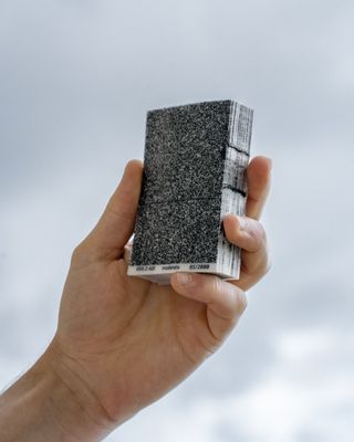
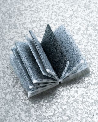
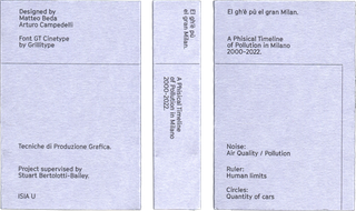
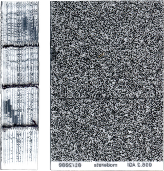
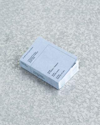
El gh’è pù el gran Milan is a data-driven publication developed using pollution level records from Milan, Italy, spanning from January 2000 to December 2022. The project translates environmental data into a visual timeline, aiming to move beyond straightforward data reading and instead provoke a sensory and perceptual experience. Through the use of computational processes and data analysis, textures were generated to correspond directly to the recorded pollution levels, allowing the data to be felt visually as well as understood intellectually. The publication also incorporates a reference scale indicating both the growth in the number of cars and the limits of air quality tolerance for human life, reinforcing the relationship between urban infrastructure and environmental conditions. Research and graphic design were developed by me in collaboration with Matteo Beda, under the supervision of Stuart Bertolotti-Bailey. The typeface used is Grillitype Cinetype. The publication was awarded Bronze in the Student category at the European Design Awards.
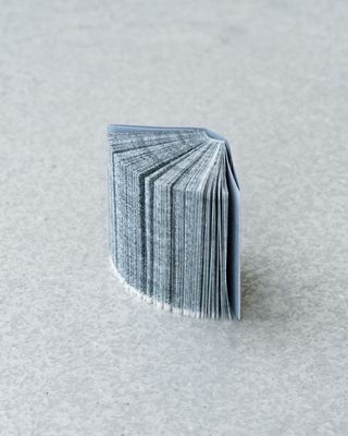
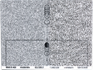
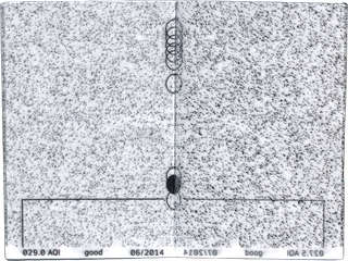
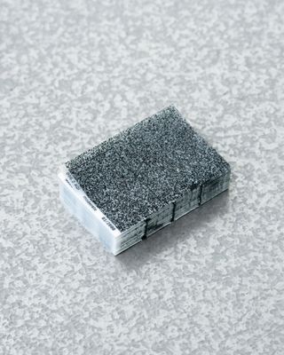
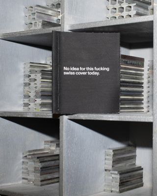
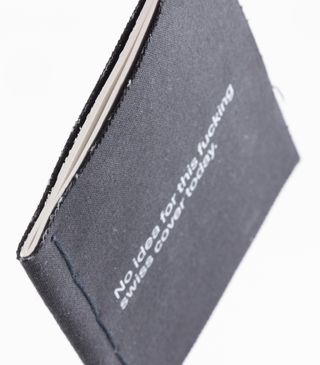
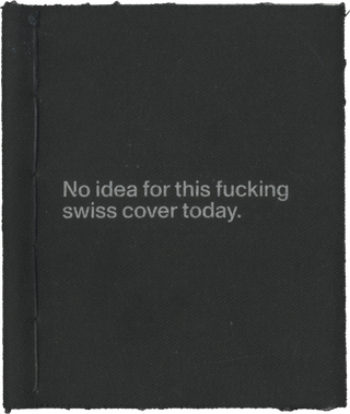
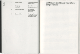
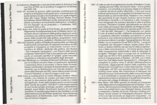
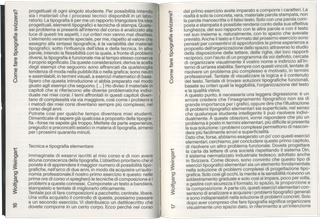
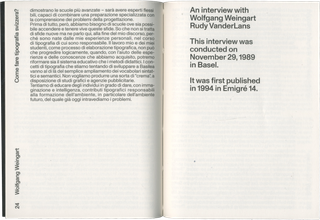
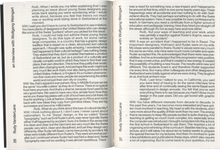
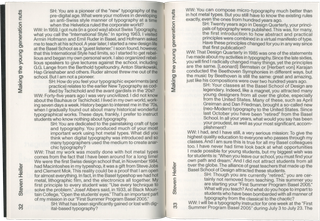
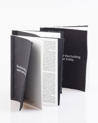
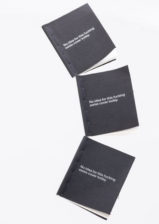
Wolfgang Weingart – Come fare tipografia svizzera? This booklet compiles a 1972 lecture by Wolfgang Weingart republished in Casabella 655/1998 and other satellite texts—a preface by Sergio Polano and two interviews with the famous graphic designer—one by Rudy VanderLans and one by Steven Heller. The title refers to an irreverent cover designed by Weingart himself for the academic American journal “Visible Language” in 1974, where he scrawled “No idea for this fucking cover today.” The book aims to respond to the spirit in which we perceive this designer today and to the content of the texts about him: soft and pocket-sized, it is intended as a study text, but one that is agile and suitable for ‘traveling’. Project with Manuela Naddeo supervised by Leonardo Sonnoli and Irene Bacchi
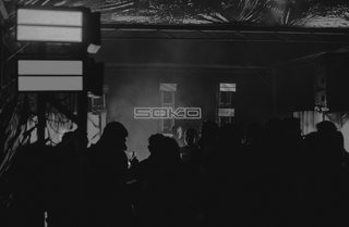
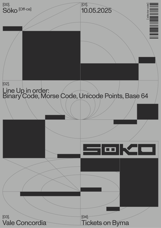
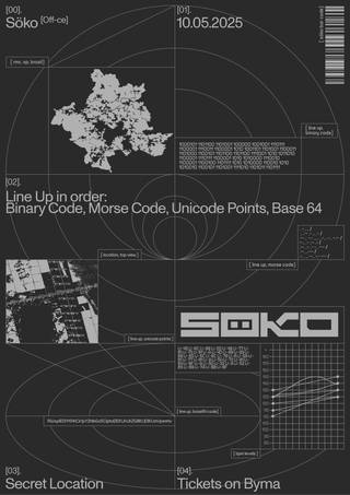
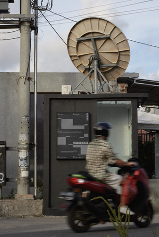
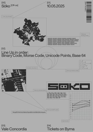
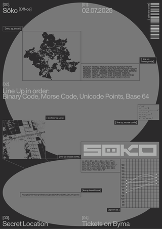
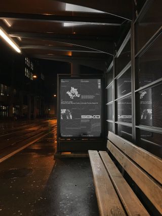
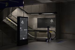
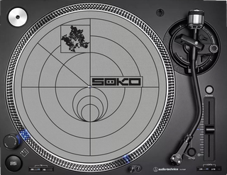
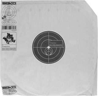
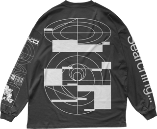
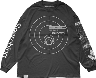
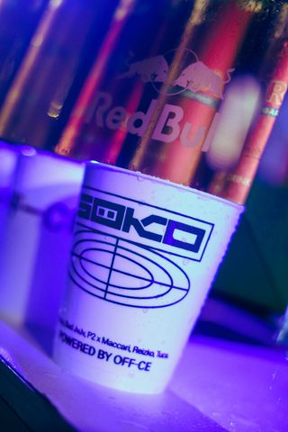
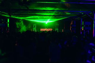
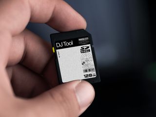
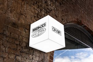
Söko is a niche party that offers a sound proposal different from those found in more traditional or established clubs, focusing on a type of electronic music that’s less conventional. When developing the visual identity, one of the client’s requirements was that the brand should also position itself as a kind of label. The name of the party resembles a Swedish word that means “to search,” which became the basis for a concept inspired by radar tracking. I noticed visual similarities between radar interfaces and some elements from my research, so the entire visual system was built around a military-inspired aesthetic, referencing radar signals and communication graphics. To reinforce this atmosphere and highlight the niche character of the event, we also incorporated coded languages like Base64, binary code, and Morse code throughout the communication of the artists

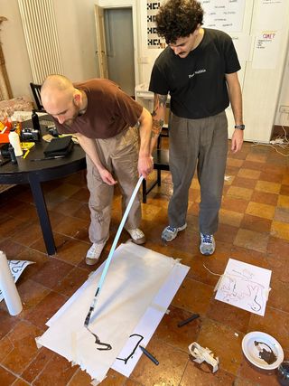
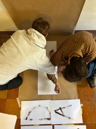
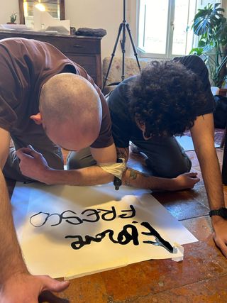
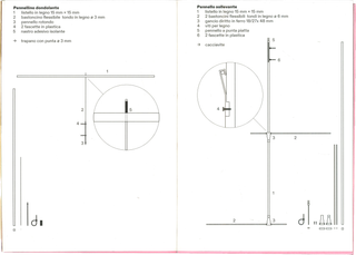
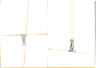
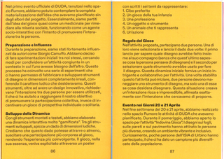
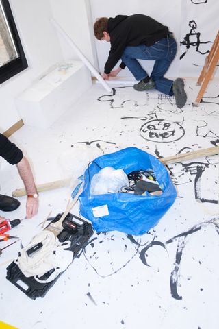
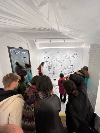
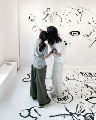
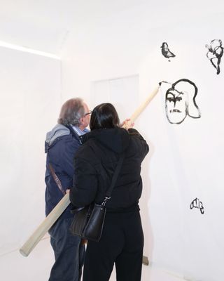
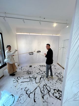
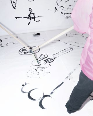
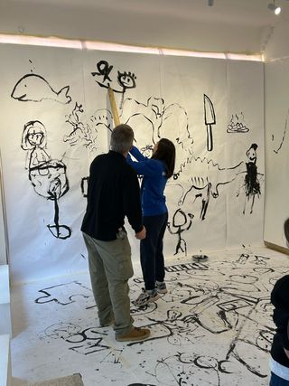
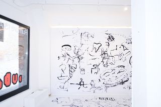
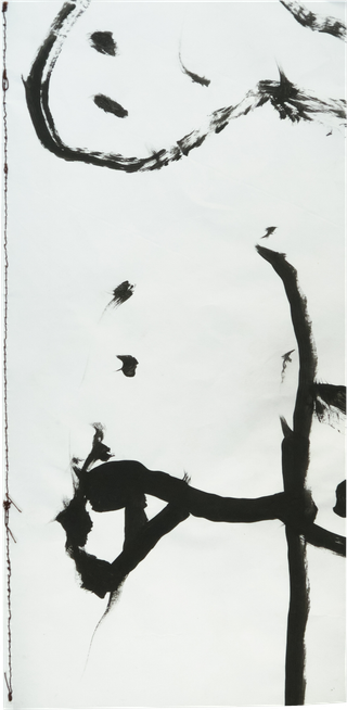
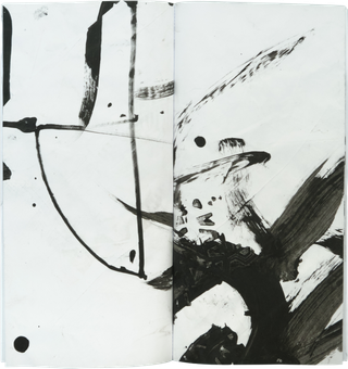
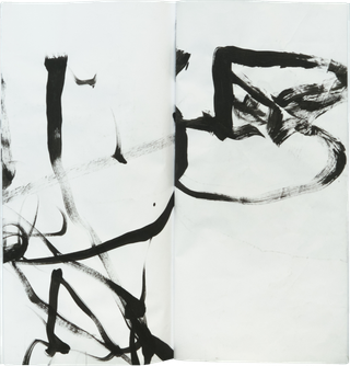
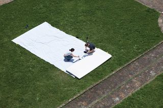
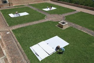
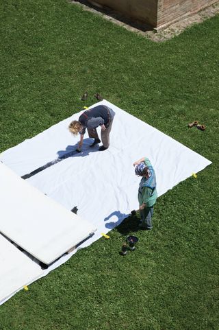
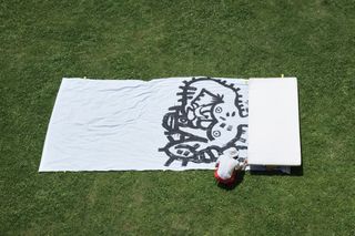
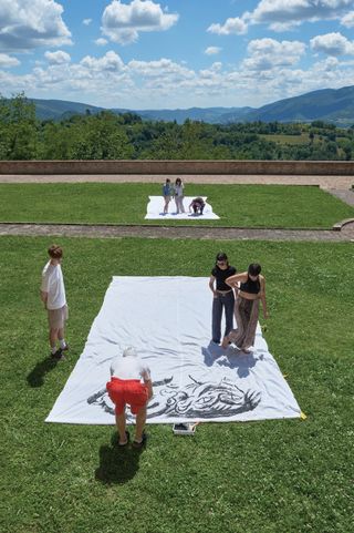
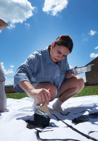
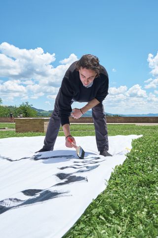
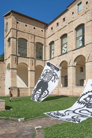
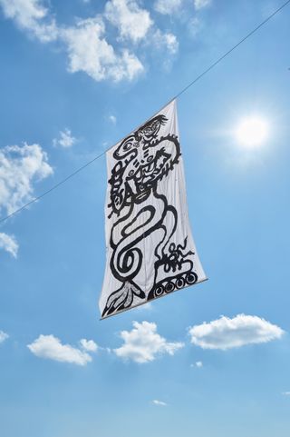
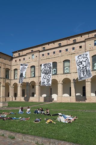
The theme of Rumore 24 ISIA U was “misery.” We approached the concept from a social perspective, focusing on how human relationships are becoming increasingly disconnected, despite the prevailing narrative of technological hyperconnectivity. Based on this idea, we designed a series of games centered on human interaction, aiming to rebuild fundamental forms of connection. We developed drawing instruments that operated at the boundary between the real and the imaginary, enabling playful dynamics where multiple participants could interact, leave traces, and build together. In a second phase, continuing to explore the ludic universe and its shifts in scale, we organized an activity in the Giardino Pensile della ISIA U inspired by the surrealist game “exquisite corpse,” adapted into a collective and performative format. The entire project was developed at ISIA U in collaboration with Filippo de Bernardi, Matteo Beda, Lukas Osele, and Filip Antunovic. Supervised by Marco Tortoiolli Ricci.
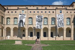
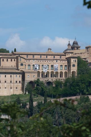
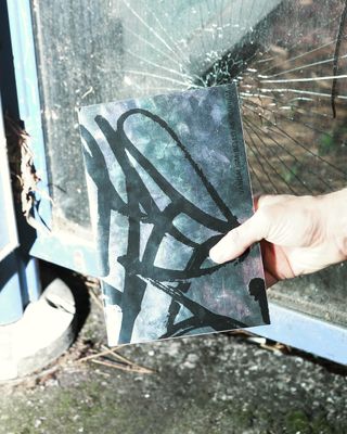
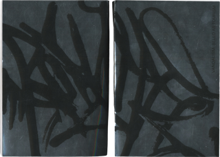
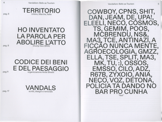
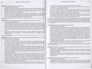
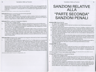
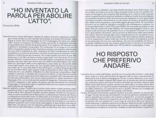
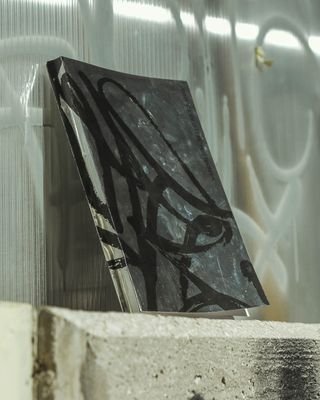
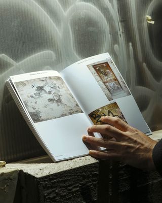
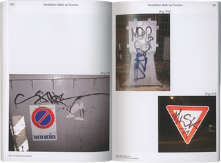
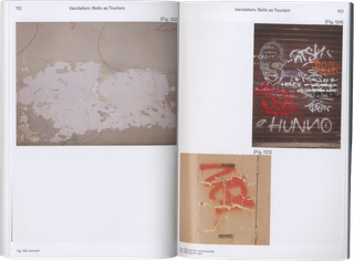
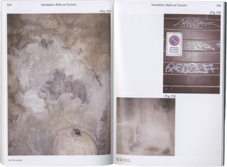
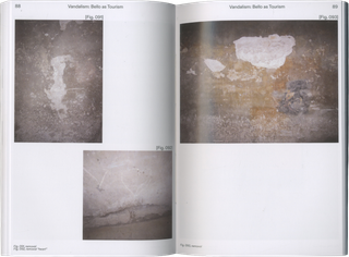
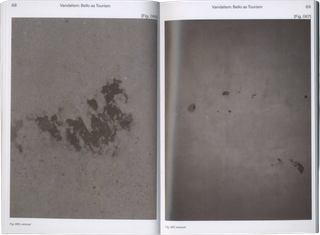
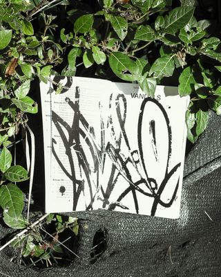
From an observation of vandalism as a recurring intervention in the urban landscape and an interest in the aesthetic and poetic structures it frequently assumes, particularly through the practice of pixo. In the context of Urbino—a UNESCO World Heritage site characterized by its preserved historical and architectural fabric—the work documents the tension between spontaneous graphic markings and an environment officially maintained in a state of permanence. By registering these interventions, the project establishes a contrast between acts commonly classified as vandalism and the controlled preservation of cultural heritage. The publication extends this discussion by drawing a parallel between vandalism and overtourism, suggesting that excessive tourist activity can operate as a similarly invasive force, contributing to the erosion of cultural and social structures. The book brings together photographic records, territorial observations, and an original text by Catarer Vandal, written by Drump Goo (Bandidos da Luz Vermelha). Legal texts were organized by Anita Silvetti. Held by Simone Casetta.
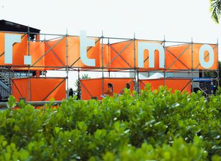
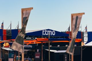
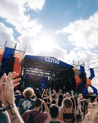
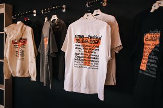
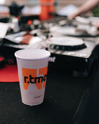
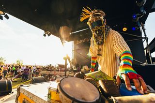
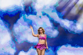
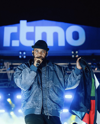
r.tmo is a festival held in Campinas (SP, Brazil) that celebrates the diversity of contemporary Brazilian music. The lineup showcases national artists who push the boundaries of what is traditionally known as Brazilian popular music, featuring names such as Criolo, BaianaSystem, Urias, among others. The challenge was to develop a visual identity that would break away from conventional clichés — especially the green and yellow color palette — and bring a more current, vibrant, and sonically diverse graphic approach. To represent this diversity, we created a dynamic system of typography and animations, capable of taking on various shapes, distortions, and movements — reflecting the aesthetic freedom and rhythmic fluidity of the festival’s lineup. The event took place on August 3, 2024, and attracted an audience of around 8,000 people. All graphic design for the project was carried out by me and Caio Oviedo.

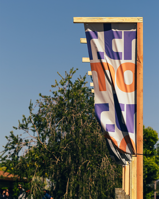
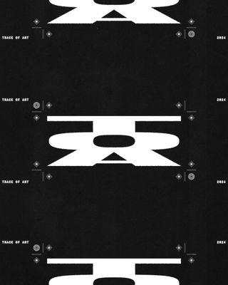
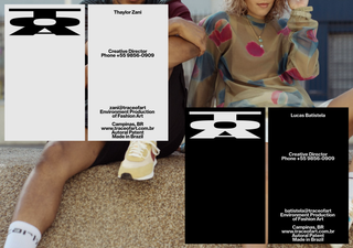
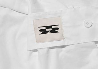
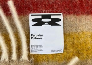
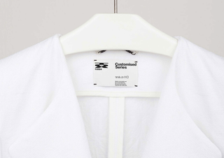
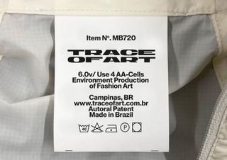
Trace of Art® is a luxury/streetwear fashion brand conceptualized by Lucas Batistela and Thaylor Zani. The design brief was informed by the Met Gala at the Metropolitan Museum of Art in New York, focusing on luxury, exclusivity, and artistic expression. The visual identity employs symbolic elements, with an extended typeface chosen to convey the notion of a trace or passage and reinforce recognition. Letterform interactions create a stable and consistent structural system. The brand is currently in development.

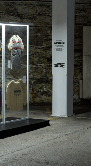
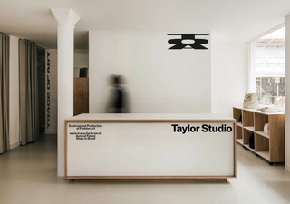
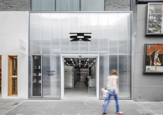
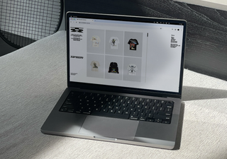
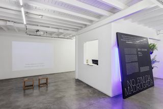
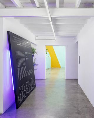
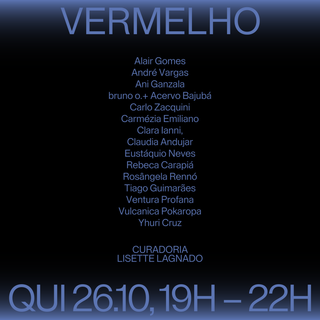
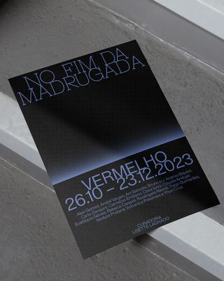
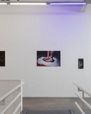
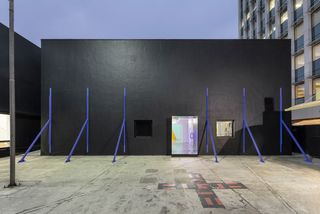
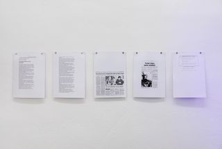
I worked on the concept and graphic design of the exhibition No Fim da Madrugada for Galeria Vermelho, developed in collaboration with Ouieieee. The project was guided by the creative direction of Louise Winkler Freshel and the design direction of Felipe Ferraz. No Fim da Madrugada — In the End of the Night — reflects on the moment when darkness is cut by a beam of light. The first color to re-emerge is a cold shade of violet, associated with light at the short-wavelength end of the visible spectrum and with the highest vibration. The project encompassed identity design and installation for Galeria Vermelho, curated by Lisette Lagnado, with facade and exhibition design by Tiago Gui. Participating artists include Alair Gomes, André Vargas, Ani Ganzala, Bruno O. + Acervo Bajubá, Carlo Zacquini, Carmézia Emiliano, Clara Ianni, Claudia Andujar, Eustáquio Neves, Rebeca Carapiá, Rosângela Rennó, Ventura Profana, Vulcanica Pokaropa, and Yhuri Cruz.
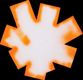
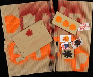
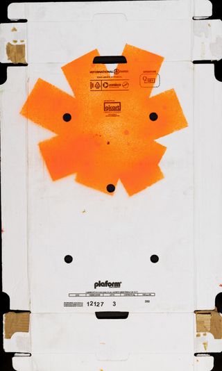
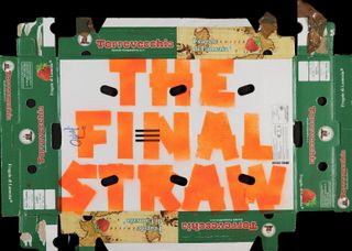
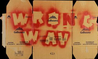
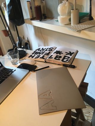
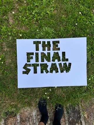
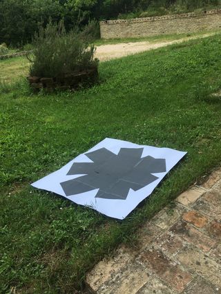
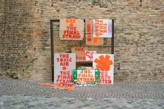
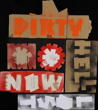
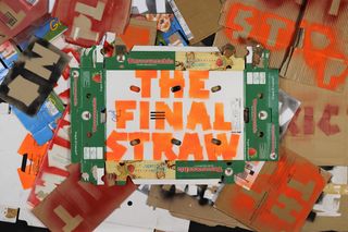
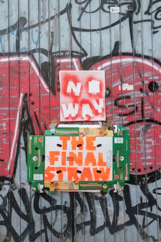
The Final Straw is a branding project for an environmental protest campaign designed for replication and deployment across different contexts. The project is based on a modular visual identity system informed by D.I.Y. principles, prioritizing accessibility, reproducibility, and adaptability. A custom typeface was developed specifically for the campaign, optimized for stencil application and intended for direct, functional use within protest environments. The visual identity is derived from the campaign’s central theme of systemic environmental degradation, referencing phenomena such as river depletion, biodiversity loss, air pollution, wildfires, and food contamination. All communication materials were developed by Filip Antunovic, Lukas Osele, and myself. Project realized at ISIA Urbino, under the supervision of Anthony Brook (Spin Studio).
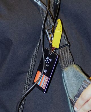
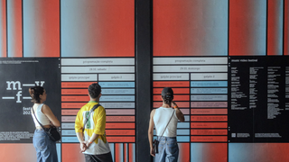
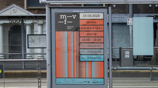
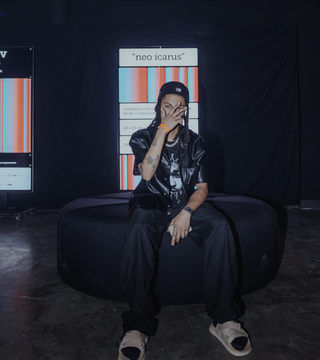
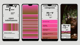
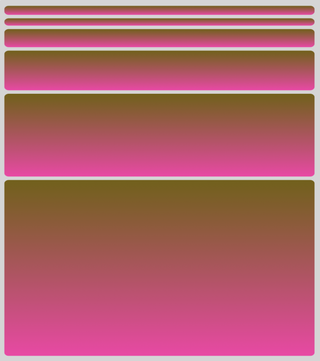
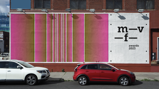
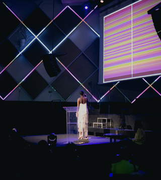
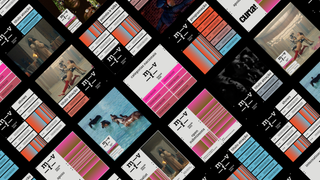
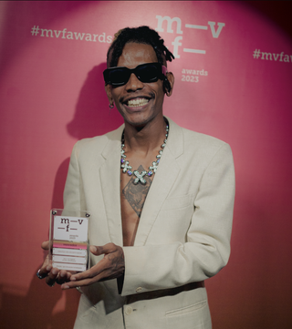
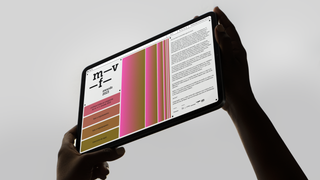
I worked on the visual identity for m-v-f awards & festival, the main music video award in Brazil, developed at Ouieieee in 2023. The project was carried out under the creative direction of Louise Winkler Freshel and the design direction of Felipe Ferraz. m-v-f awards & festival exists to celebrate music videos and to emphasize their relevance, impact, and influence on popular culture and contemporary creative expression. The scope of the project included the visual identity for all social media communication, vignettes, festival materials, backdrops, trophies, as well as award and artist performance videos. The graphic design reflects the vibrant and dynamic nature of the event, establishing a visual language driven by movement and gradient color transitions. Fluid lines and shifting hues create a sense of continuous motion and energy, echoing the diversity of sounds, rhythms, and cultural expressions present throughout the festival.
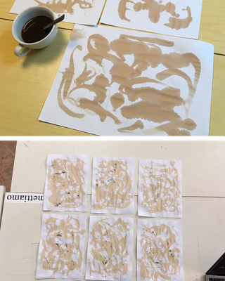
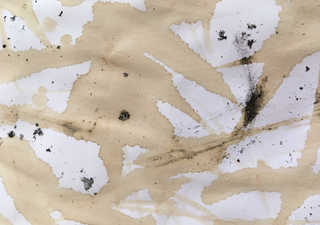
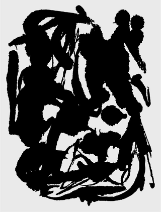
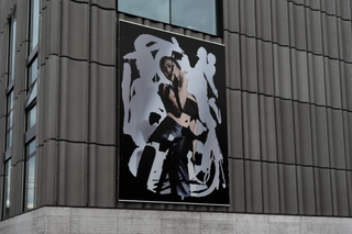
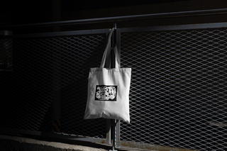
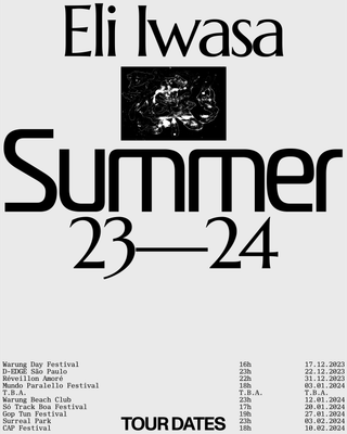
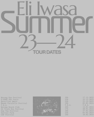
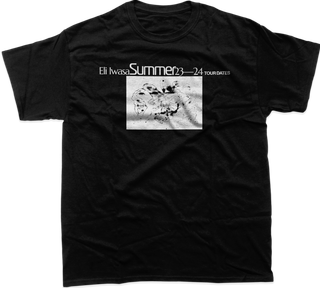
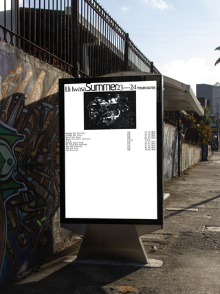
I was invited to develop a new personal identity for Eli Iwasa in 2023. In this context, many DJs rely on typography-based logos, which often end up leaning toward a corporate aesthetic. During one of our conversations, Eli mentioned that one of her favorite films was Coffee and Cigarettes by director Jim Jarmusch. Seeking a more proprietary and expressive element, I chose to draw freely on different surfaces using only coffee and cigarette ashes. Through this process, a series of unique textures was created, allowing the artist to use them freely across printed materials as well as large-scale backdrops and visual environments for her live performances.

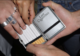
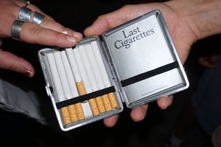
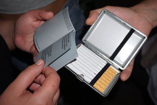
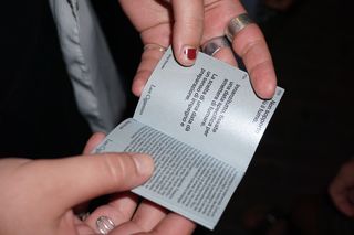
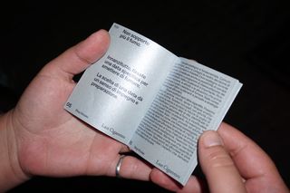
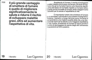
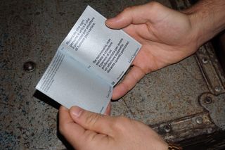
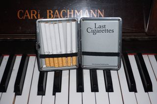
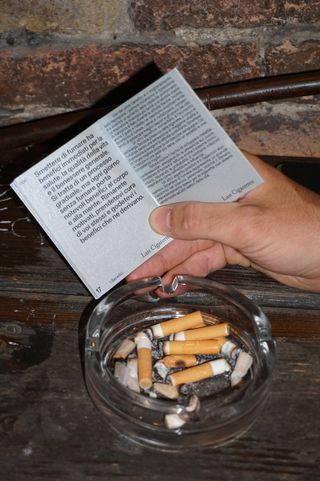
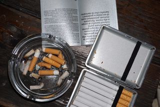
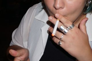
This publication was developed within a course led by Armand Mevis, based on an open-ended assignment defined by the constraint of a 70 × 100 cm sheet of paper. The brief invited the investigation of a chosen object through a visual and editorial approach. The cigarette was selected as the subject, considered here as an increasingly obsolete object carrying significant cultural and symbolic weight. The project examines the evolving social perception of smoking and its progressive withdrawal from public space. Silver paper, cut into A5 sheets, was used to produce a compact publication, emphasizing the object’s residual material value and symbolic presence. The cover was sealed with metallic dots, referencing the visual language and industrial character associated with the object. Project realized at ISIA U, under the supervision of Armand Mevis (Werkplaats Typografie).
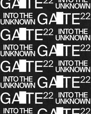
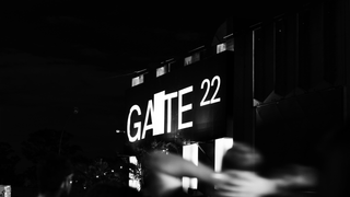
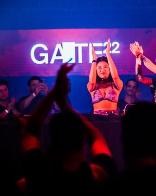
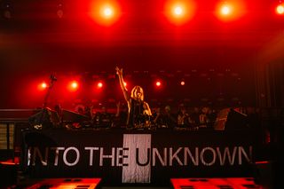
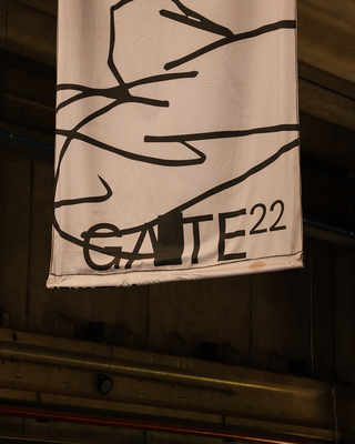
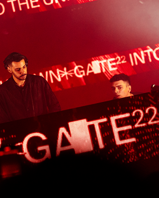
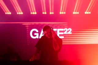
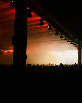
In 2022, I designed the graphic concept and logo for Gate22 , a club in Campinas, Brazil, co-founded by the legendary dj Eli Iwasa. For the design, I based the idea on the famous opening scene of 2001: A Space Odyssey by Stanley Kubrick. In this scene, primates fight for territory and survival in a harsh environment. After encountering a mysterious black monolith, one of them has an epiphany and discovers that a bone can be used as a tool—and later, as a weapon. Kubrick never explained the true meaning of the monolith, but it seems to have a prophetic role: pushing civilization forward. But at what cost?. —Because the club is called “Gate,” I created the concept around the metaphor of the unknown—the idea that the black monolith is a portal that appears during major transitions and goes beyond human understanding. Project with Caio Oviedo
